Menu Close

Category: interface design

Clustering Data: Generating Organization from the Ground Up

Flickr: water tag clustersMy trip to the 2008 Information Architecture Summit (IA Summit) down in Miami has me thinking a lot about helping people find information. In this post I am going to examine clustering data.

Flickr Tag Clusters
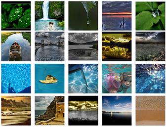
Tag clusters are not new on Flickr – they were announced way back in August of 2005. The best way to understand tag clusters is to look at a few. Some of my favorites are the water clusters (shown in the image above). From this page you can view the reflection/nature/green cluster, the sky/lake/river cluster, the blue/beach/sun cluster or the sea/sand/waves cluster.

So what is going on here? Basically Flickr is analyzing groupings of tags assigned to Flickr images and identifying common clusters of tags. In our water example above – they found four different sets of tags that occurred together and distinctly apart from other sets of tags. The proof is in the pudding – the groupings make sense. They get at very subtle differences even though the mass of data being analyzed is from many different individuals with many different perspectives.

Tag clusters are very powerful and quite different from tag clouds. Tag clouds, by their nature, are a blunt instrument. They only show you the most popular tags. Take a look at the tag cloud for the Library of Congress photostream on Flickr. I do learn something from this. I get a sense of the broad brush topics, time periods and locations. But if you look at the full list of Library of Congress Flickr tags you see what a small percentage the top 150 really are (and yes.. that page does takes a while to load). Who else is now itching to ask Flickr to generate clusters within the LOC tag set?

Steve.Museum
Another example of cultural heritage images being tagged is the Steve Museum Art Museum Social Tagging Project which lets individuals tag objects from museums via Steve Tagger. It resembles the Library of Congress on Flickr project in that it includes existing metadata with each image and permits users to add any tags they deem appropriate. I think it would be fascinating to contrast the traffic of image taggers on Steve.Museum vs Flickr for a common set of images. Is it better to build a custom interface that users must seek out but where you have complete control over the user experience and collected data? Or is it better to put images in the already existing path of users familiar with tagging images? I have no answers of course. All I know is I wish I could see the tag clusters one could generate off the Steve.Museum tag database. Perhaps someday we will!

Del.icio.us Tags
del.icio.us related tags
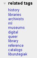
Del.icio.us, a web service for storing and tagging your bookmarks online, supports what they call ‘related tags’ and ‘tag bundles’. If you view the page for the tag ‘archives’ – you will see to the far right a list of related tags like those shown in the image here. What is interesting is that if I look at my own personal tag page for archives I see a much longer list of related tags (big surprise that I have a lot of links tagged archives!) and I am given the option of selecting additional tags to filter my list of links via a combination of tags.

Del.icio.us’s ‘tag bundles’ let me create my own named groupings of tags – but I must assemble these groups manually rather than have them generated or suggested. On the plus side, Del.icio.us is very open about publishing its data via APIs and therefore supporting third party tools. I think my favorite off that list for now has to be MySQLicious which mirrors your del.icio.us bookmarks into a MySQL database. Once those tags are in a database, all you need are the right queries to generate the clusters I want to see.

Clusty: Clustered Search Results
Clusty: clusters screen shot
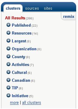
An example of what this might look like for search results can be seen via the search engine Clusty.com from the folks over at Vivisimo. For example – try a search on the term archives. This is one of those search terms for which general web searching is usually just infuriating. Clusty starts us with the same top 2 results as a search for archives on Google does, but it also gives us a list of clusters on the left sidebar. You can click on any of those clusters to filter the search results.

Those groups don’t look good to you? Click the ‘remix’ link in the upper right hand corner of the cluster list and you get a new list of clusters. In a blog post titled Introducing Clustering 2.0 Vivisimo CEO Raul Valdes-Perez explains what happens when you click remix:

With a single click, remix clustering answers the question: What other, subtler topics are there? It works by clustering again the same search results, but with an added input: ignore the topics that the user just saw. Typically, the user will then see new major topics that didn’t quite make the final cut at the last round, but may still be interesting.

I played for a while.. clicking remix over and over. It was as if it was slicing and dicing the facets for me – picking new common threads to highlight. I liked that I wasn’t stuck with what someone else thought was the right way to group things. It gave me the control to explore other groupings.

Ontology is Overrated
Clay Shirky’s talk Ontology is Overrated: Categories, Links and Tags from the spring of 2005 ties a lot of these ideas together in a way that makes a lot of sense to me. I highly recommend you go read it through – but I am going to give away the conclusion here:

It’s all dependent on human context. This is what we’re starting to see with del.icio.us, with Flickr, with systems that are allowing for and aggregating tags. The signal benefit of these systems is that they don’t recreate the structured, hierarchical categorization so often forced onto us by our physical systems. Instead, we’re dealing with a significant break — by letting users tag URLs and then aggregating those tags, we’re going to be able to build alternate organizational systems, systems that, like the Web itself, do a better job of letting individuals create value for one another, often without realizing it.

I currently spend my days working with controlled vocabularies for websites, so please don’t think I am suggesting we throw it all away. And yes, you do need a lot of information to reach the critical mass needed to support the generation of useful clusters. But there is something here that can have a real and positive impact on users of cultural heritage materials actually finding and exploring information. We can’t know how everyone will approach our records. We can’t know what aspects of them they will find interesting.

There Is No Box
Archivists already know that much of the value of records is in the picture they paint as a group. A group of records share a context and gives the individual records meaning. Librarians and catalogers have long lived in a world of shelves. A book must be assigned a single physical location. Much has been made (both in the Clay Shirky talk and elsewhere) that on the web there is no shelf.

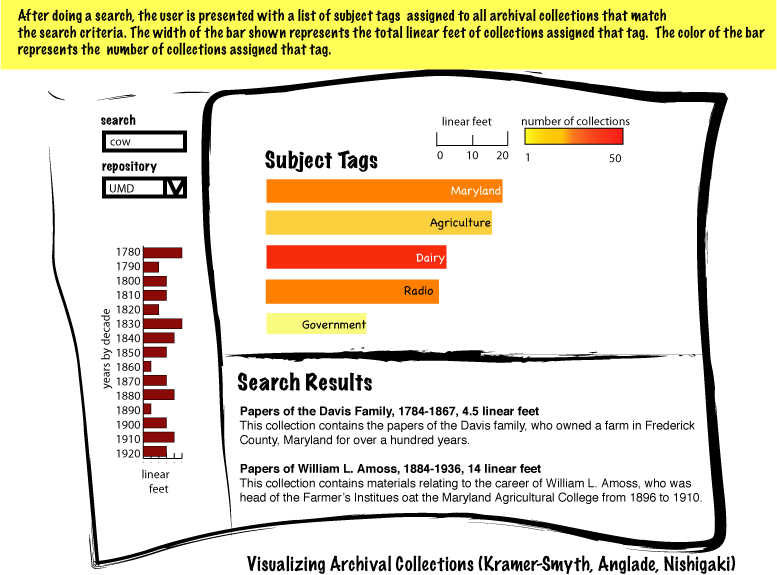
What if we take the analogy a step further and say that for an online archives there is no box? Of course, just as with books, we still need our metadata telling us who created this record originally (and when and why and which record comes before it and after it) – but picture a world where a single record can be virtually grouped many times over. Computer programs are only going to get better at generating clusters, be they of user assigned tags or search results or other metdata. From where I sit, the opportunity for leveraging clustering to do interesting things with archival records seems very high indeed.

Of Pirates, Treasure Chests and Keys: Improving Access to Digitized Materials

Key to Anything by Stoker Studios (flickr)Dan Cohen posted yesterday about what he calls The Pirate Problem. Basically the Pirate Problem can be summed up as “there are ways of acting and thinking that we can’t understand or anticipate.” Why is that a ‘Pirate Problem’? Because a pirate pub opened near his home and rather than folding shortly thereafter due to lack of interest from the ‘very serious professionals’ who populate DC suburbs – the pub was a rousing success due to the pirate aficionados who came out of the woodwork to sing sea shanties and drink grog. This surprising turn of events highlighted for him the fact that there are many ways of acting and thinking (some people even know all the words to sea shanties without needing sheet music).

Dan recently delivered the keynote speech at a workshop at the University of North Carolina at Chapel Hill. The workshop brought together dozens of historians to talk about how the 16 million archival documents of the Southern Historical Collection (SHC) should be put online. He devoted his keynote “to prodding the attendees into recognizing that the future of archives and research might not be like the past” and goes on in his post to explain:

The most memorable response from the audience was from an award-winning historian I know from my graduate school years, who said that during my talk she felt like “a crab being lowered into the warm water of the pot.” Behind the humor was the difficult fact that I was saying that her way of approaching an archive and understanding the past was about to be replaced by techniques that were new, unknown, and slightly scary.

This resistance to thinking in new ways about digital archives and research was reflected in the pre-workshop survey of historians. Extremely tellingly, the historians surveyed wanted the online version of the SHC to be simply a digital reproduction of the physical SHC.

Much of the stress of Dan’s article is on fear of new techniques of analysis. The choppy waters of text mining and pattern recognition threaten to wash away traditional methods of actually reading individual pages and “most historians just want to do their research they way they’ve always done it, by taking one letter out of the box at a time”.

I certainly like the idea of new technologically based ways of analyzing large sets of cultural heritage materials, but I also believe that reading individual letters will always be important. The trick is finding the right letter!

And of course – we still need the context. It isn’t as if when we digitize major collections like the SHC that we are going to scan and OCR each page without regard to which box it came out of. We can’t slice and dice archival records and manuscripts into their component parts to feed into text analysis with no way back to the originals.

I like to imagine the combination of all the new technology (be it digitization, cross collection searching, text mining or pattern recognition) as creating keys to different treasure chests. Humanities scholars are treasure hunters. Some will find their gems through careful reading of individual passages. Others will discover patterns spread across materials now co-existing virtually that before digitization would have been widely separated by space and time. Both methods will benefit from the digitization of materials and the creation of innovative search and text analysis tools. Both still require an understanding of a material’s origin. The importance of context isn’t going anywhere – we still need to know which box the letter came from (and in a perfect world, which page came before and which came after). I want scholars to still be able to read one page from the box – I just want them to be able to do it from home in the middle of the night if they are so inclined with their travel budget no worse for wear.

Dan ties his post together by pointing out that:

… in Chapel Hill I was the pirate with the strange garb and ways of behaving, and this is a good lesson for all boosters of digital methods within the humanities. We need to recognize that the digital humanities represent a scary, rule-breaking, swashbuckling movement for many historians and other scholars.

In my opinion, the core message should be that we just found more locked treasure chests – and for those who are interested, we have some new keys that just might open those locks. I enjoyed the Pirate metaphor (obviously) and I appreciate that there are real issues here relating to strong discomfort with the fast changing landscape of technology, but I have to believe that if we do something that prevents historians from being able to read one letter at a time we are abandoning the treasure chests that are already open for the new ones for which we haven’t yet found the right keys. I am greedy. I want all the treasure!

Image credit: key to anything by Stoker Studios via flickr

SAA2008 Here I Come! After the Revolution: Unleashing the Power of EAD

SAA2008 I got the word just before the holidays – the panel proposal of which I was a part has been accepted for SAA 2008 in San Francisco . The title of the panel is ‘After the Revolution: Unleashing the Power of EAD’ and the working title for my paper/presentation is ‘Visualizing Archival Collections: Leveraging the Power of EAD’.

My co-presenters are Max Evans (currently of the NHPRC, soon to be of the LDS Church Historical Department) and Elizabeth Yakel (of University of Michigan, School of Information). Jodi Allison-Bunnell from Northwest Digital Archives, Orbis Cascade Alliance is our panel Chair.

This is the description of our panel that we submitted with our proposal:

Encoded Archival Description (EAD) was created in 1995 to increase uniformity and interoperability of data about archival collections to facilitate discovery. It has yet to realize that goal: most online finding aids merely recreate paper documents. Speakers will demonstrate how the structured, standardized nature of EAD can form the basis of user-friendly interfaces and finding aids that can accommodate multiple perspectives and utilize graphical and visual interfaces–while faithfully recording and presenting the context, structure, and content of the collection. Panelists will also address the challenges of unleashing the power of EAD, including normalizing XML, the lack of standard values for cross-institutional aggregation of data, and different approaches to subject terms, with a discussion of the technological and practical issues that surround them. The session relates to the SAA strategic priorities of technology and public awareness and engages elemental questions of revolutionary and evolutionary change.

My portion of the panel will focus on my ArchivesZ information visualization project. I will be discussing both the power of this type of graphical interface to archival collections as well as addressing the roadblocks to their practical implementation. My plan is to continue the work I started last Spring over the course of this Spring and Summer – and show off a new version of ArchivesZ in San Francisco (as well as online here of course!).

Here are the descriptions of Max, Elizabeth and Jodi’s planned contributions (cribbed from our proposal submission):

  • Max Evans will explore the fundamental purposes of finding aids and explore what can be done to leverage EAD’s structure to render graphical, informative, and elegant finding aids online.
  • Elizabeth Yakel will discuss usability test findings and how these were incorporated into the EAD-based Polar Bear Expedition Digital Collections to allow communities to engage with collections in new ways.
  • Jodi Allison-Bunnell brings a lively interest in user-centered presentations of finding aids that emerge from her work as manager of a five-state EAD consortium.

I am so pleased and excited. So – who is planning on going to San Fransisco in August? I hope to see you there.

Image Credit: Society of American Archivists, ARCHIVES 2008: Archival R/Evolution & Identities web page.

Visualizing Archival Collections

As I mentioned earlier, I am taking an Information Visualization class this term. For our final class project I managed to inspire two other classmates to join me in creating a visualization tool based on the structured data found in the XML version of EAD finding aids.

We started with the XML of the EAD finding aids from University of Maryland’s ArchivesUM and the Library of Congress Finding Aids. My teammates have written a parser that extracts various things from the XML such as title, collection size, inclusive dates and subjects. Our goal is to create an innovative way to improve the exploration and understanding of archival collections using an interactive visualization.

Our main targets right now are to use a combination of subjects, years and collection size to give users a better impression of the quantity of archival materials that fit various search criteria. I am a bit obsessed about using the collection size as a metric for helping users understand the quantity of materials. If you do a search for a book in a library’s catalog – getting 20 hits usually means that you are considering 20 books. If you consider archival collections – 20 hits could mean 20 linear feet (20 collections each of which is 1 linear foot in size) or it could mean 2000 linear feet (20 collections each of which is 100 linear feet in size). Understanding this difference is something that visualization can help us with. Rather than communicating only the number of results – the visualization will communicate the total size of collections assigned each of the various subjects.

I have uploaded 2 preliminary screen mockups one here and the second here trying to get at my ideas for how this might work.

Not reflected in the mock-ups is what could happen when a user clicks on the ‘related subject’ bars. Depending on where they click – one of two things could happen. If they click on the ‘related subject’ bar WITHIN the boundaries of the selected subject (in the case above, that would mean within the ‘Maryland’ box), then the search would filter further to only show those collections that have both the ‘Maryland’ and newly ‘added’ tag. The ‘related subjects’ list and displayed year distribution would change accordingly as well. If, instead, the user clicks on a ‘related subject’ bar OUTSIDE the boundary of the selected subject — then that subject would become the new (and only) selected subject and the displayed collections, related subjects and years would change accordingly.

So that is what we have so far. If you want to keep an eye on our progress, our team has a page up on our class wiki about this project. I have a ton of ideas of other things I would love to add to this (my favorite being a map of the world with indications of where the largest amount of archival materials can be found based on a keyword or subject search) – but we have to keep our feet on the ground long enough actually build something for our class project. This is probably a good thing. Smaller goals make for a greater chance of success.

Getting Your Toes Wet: Basic Principals of Design for the New Web

Ellyssa Kroski of InfoTangle has created a great overview of current trends in website and application design in her post Information Design for the New Web. If you are going to Computers in Libraries, you can see her present the ideas she discusses in her post in a session of the same name on Monday April 16.

She highlights 3 core principles with clear explanations and great examples:

  • Keep it Simple
  • Make it Social
  • Offer Alternate Navigation

As archives continue to dive into the deep end of the internet pool, more and more archivists will find themselves participating in discussions about website design choices. Understanding basic principals like those discussed in Kroski’s post will go a long way to making archivists feel more comfortable contributing to these sorts of discussions.

Don’t think that things like this should be left to the IT department or only the ‘techie archivists’ on your staff (if you have any). You all have a lot to contribute. You know your collections. You know the importance of archival principals of provenance, original order and context. There are lots of aspects of archival materials that traditional web designers might not consider important. Things that you know are very important if people are to understand your archives’ materials while browsing from the comfort of their homes.

So dip your toes in. Learn some buzz words, look at some fun websites and get comfortable with some innovative ideas. The water is just fine.