Chapter 9 of Partners for Preservation is ‘Sharing Research Data, Data Standards and Improving Opportunities for Creating Visualisations’ by Dr. Vetria Byrd. This is the second chapter of Part III: Data and Programming. I originally had envisioned a chapter focused on the ways that standardization, controlled vocabularies, and consistent documentation could increase the re-use of data. All these things help people, separated by either space or time, to understand and leverage the work of others. Scientific communities around the world have led a lot of this work. The work of archivists to preserve data in a meaningful way is made easier by it.
Luckily for all of us, my hunt for contributing authors brought Dr. Vetria Byrd to this project. Her professional focus on visualization led me to approach the topic of sharing data and data standards from a different direction.
I am a very visual thinker. I truly believe that with a large enough whiteboard, you could plan (or explain) anything. Those who are familiar with my research back in graduate school may recall my visualization project, ArchivesZ, focused on visualizing archival descriptive information. So, when I realized that this chapter could talk about both data standards and visualization, I was sold.
The introduction to the chapter explains:
“This chapter looks at the collaborative nature of sharing the underlying data that propels the system, rather than focusing on systems and services. It provides an overview of the visualisation process, and discusses the challenge of sharing research data and ways data standards can increase opportunities for creating and sharing visualisations, while also increasing visualisation capacity building among researchers and scientists.”
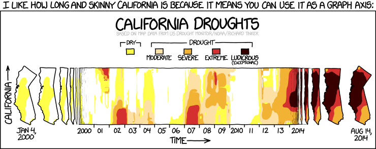
A single visualization is often reliant on multiple sets of data that have been analyzed, linked, and summarized over multiple iterations to generate the final product. Take the xkcd webcomic featured at the top of this post. The citation within the webcomic itself reads “based on map data from US Drought Monitor/NOAA/Richard Tinker”. Digging a bit deeper, I found my way to the US Drought Monitor website which provides easy access to data and maps. You can learn more about the data included on the site and read the details about how they calculate the drought classifications.
I was able to quickly generate this chart, showing California Drought data over time. While it certainly makes it clear that there has been a dramatic increase of drought over time, it does not communicate the same information as the maps in the webcomic above.
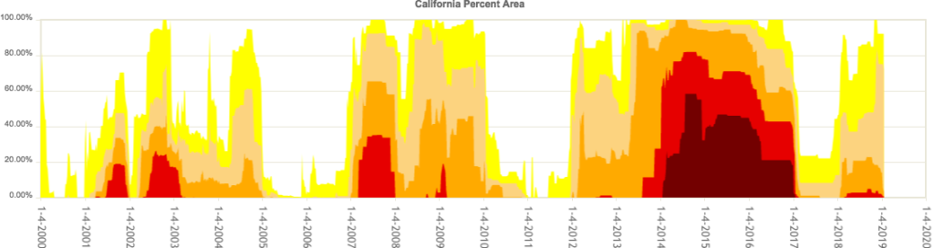
I think this is a great example of how different ways of visualizing information can fundamentally change our understanding of something. Documentation of and transparency in sharing data is key. It gives the tools to a broader audience of creative individuals who can then increase the visibility of the original work and build upon it.
 Bio:
Bio:
Dr. Vetria Byrd is an Assistant Professor of Computer Graphics Technology and Director of the Byrd Data Visualization Lab in the Polytechnic Institute at Purdue University’s main campus in West Lafayette, Indiana. Dr. Byrd is introducing and integrating visualization capacity building into the undergraduate data visualization curriculum. She is the founder of the Broadening Participation in Visualization (BPViz) Workshop. She served as a steering committee member on the Midwest Big Data Hub (2016-2018). She has taught data visualization courses on national and international platforms as an invited lecturer of the International High Performance Computing Summer School (IHPCSS). Her visualization webinars on Blue Waters, a petascale supercomputer at the National Center for Supercomputing Applications at the University of Illinois at Urbana-Champaign, introduce data visualization to audiences around the world. As described in her invited plenary talk featured on HPC Wire Dr. Byrd utilizes data visualization as a catalyst for communication, a conduit collaboration and as a platform to broaden participation of underrepresented groups in data visualization. Dr. Byrd’s research interests include data visualization, data analytics, data integration, visualizing heterogeneous data and the science of learning and incorporating data visualization at the curriculum level and everyday practice.
Image source: xkcd comic: California. https://www.xkcd.com/1410/
PS: If you haven’t yet discovered xkcd (self-described as “A webcomic of romance, sarcasm, math, and language.”) – you are in for a treat!