Menu Close

Category: interface design

SAA2009: Building, Managing and Participating in Online Communities

SAA 2009: Sustainable Archives AUSTIN 09
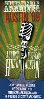
It is official – the panel I proposed for SAA 2009 (aka, Sustainable Archives: AUSTIN 2009) was accepted!

Title: Building, Managing and Participating in Online Communities: Avoiding Culture Shock Online

Abstract: As more archival materials move online, archivists must become adept at participating in and managing online communities. This session will discuss real world experiences of this involvement, including putting images into the Flickr Commons and links to archival materials in Wikipedia, as well as guidelines on cultural norms within online communities. We will also discuss choosing between building new communities from scratch vs joining a broader, existing community (such as the Flickr Commons).

I will be serving as session chair and moderator for our group of fabulous panelists (finances and travel plans permitting):

The intention is for this session to begin with very brief presentations showing off the current projects at our panelists’ institutions and follow that up with lots of time for discussion and answering of questions.

We see our target audience as archivists who want to hear about real world experiences of working within existing online communities (such as Wikipedia or Flickr) and building new communities dedicated to cultural heritage materials. The session will target individuals with less experience with Web 2.0 and social media implementations, but the lessons learned should also be of interest to those already in the implementation stages of their own projects.

I will put out a call for questions as we get closer to the conference so that our group can get an idea of what people are interested in learning about specifically, so start making notes now. Hope to see you in Austin!

Google Tackles Magazine Archives

Google Book Search: Popular Mechanics Jan 1905 Cover ImageAs has been reported around the web today, Google is now digitizing and adding magazines to Google Book Search. This follows on the tails of the recent Google Life Photo archive announcement.

I took a look around to see what I could see. I was intrigued by the fact that I couldn’t see a list of all the magazines in their collection. So I went after the information the hard way and kept reloading the Google Book Search home page until I didn’t see any new titles displayed in their highlighted magazine section. This is what I came up with, roughly grouped by general topic groupings.

Science and technology:

Lifestyle and city themed:

African American:

  • Ebony Jr!: May 1973 through October 1985
  • Jet: November 1961 through October 2008
  • Black Digest: Named ‘Negro Digest’ from November 1961 through April 1970, then Black Digest from May 1970 through April 1976.

Health, nutrition and organic:

  • Women’s Health and Men’s Health: January 2006 through present. I found it very amusing to be able to scan the covers of all the issues so easily – true for all of these magazines of course, but funny to see cover after cover of almost identically clad men and women exercising.
  • Prevention: January 2006 through the present
  • Better Nutrition: January 1999 through December 2004
  • Organic Gardening: November 2005 to the present
  • Vegetarian Times: March1981 through November 2004

Sports and the outdoors:

They of course promise more magazines on the way, so if you are reading this long after mid December 2008  I would assume there are more magazines and more issues available now. I hope that they make it easier to browse just magazines. Once they have a broader array of titles – how neat would it be to build a virtual news stand for a specific week in history? Shouldn’t be hard – they have all the metadata and cover images they need.

I love being able to read the magazine – advertising and all. They display the covers in batches by decade or 5 year period depending on the number of issues. I also like the Google map provided on each magazines ‘about’ page that shows ‘Places mentioned in this magazine’ and easily links you directly to the article that mentions the location marked on the map.

I think it is interesting that Google went with more of a PDF single scrolling model rather than an interface that mimics turning pages. In many issues (maybe all?) they have hot-linked the table of contents so that you can scroll down to that section instantly. You can also search within the magazine, though from my short experiments it seems that only the articles are text indexed and the advertisements are not.

Google’s current model for search is to return results for magazines mixed in with books in Google Book Search results – but they do let you limit your results to only magazines from their Advanced Search page within Google Book Search. See these results for a quick search on sunscreen in magazines.

Overall I mark this as a really nice step forward in access to old magazines. As with many visualizations, seeing the about page for any of these magazines made me ask myself new questions.  It will be interesting to see how many magazines sign on to be included and how the interface evolves.

To read more about Google’s foray into magazine digitization and search take a look at:

For a really nice analysis of the information that Google provides on the magazine pages see Search Engine Land’s Google Book Search Puts Magazines Online.

Susa 2.0: Max Evans’ Finding Aid Prototype

Susa Young GatesAs part of his portion of our SAA 2008 panel in San Francisco, Max Evans demonstrated his prototype for a new way to view an EAD finding aid. You can download his presentation from the SAA’s site: Finding Aids for the 21st Century: The Next Evolution.

Max’s prototype of Susa 2.0 is now online! He asked that I make sure you know it works best (showing all the intended mouse over text for links) with Internet Explorer version 6.0. The prototype presents the finding aid of the Susa Young Gates Papers from the Utah State Historical Society. His design tackles the major issues that plague large finding aids normally displayed in traditional single page layouts. Anyone who has looked at a large finding aid online has had the experience of being scrolled down somewhere in the middle and realizing they have no idea what they are looking at. What folder is this item in? What box is this folder in? Am I reading through a list of letters from 1950 or are these the ones from 1970?

Context is hard to communicate when you are dealing with long lists of folders that stretch longer than the length of the screen. Max’s design uses a three column approach to provide context from left to right. His design also gives users a way to look at the full list of either items or folders, independent of their originating containers – each list then sortable in three different ways: ‘as arranged’, alphabetically or by date. I love this page which shows how a scanned document might be displayed within the proper context of the collection – in this case, page 2 of document 1 of the General Correspondence from 1886-1909. All of these ideas get at the heart of giving researchers more control over how to tackle the records in a collection while making sure that they don’t loose the tools that ordered documents in a folder would provide them in the research room.

His prototype takes a step beyond just changing how the finding aid itself is presented – but also considers how the work flow of a researcher can be improved while also simplifying the record request processes. The prototype gives the patron the option to request the scanning of specific folders or items. They can also add records to their ‘research cart’ to either request the proper boxes be retrieved or to store the records in a personal research area within the archives website – both possibilities sound useful to me.

Max’s prototype is such a great example of rethinking how people are expected to work with archival records within the confines of the information we already have available in finding aids as they exist today. I highly recommend you give Susa 2.0 a look. It is a testament to Max’s incredible patience that he was able to create this prototype using over 200 separate HTML files – but it also sets the bar high for what we could be doing with our interface design!

Political Campaign Ads from the NBC News Archives Find New Audience on Hulu.com

Thinking about politics, but waxing nostalgic for the good old days of movie stars and snappy jingles? Surf over to Hulu.com’s new gallery of Historic Campaign Ads. These are from iCue, which bills itself as “A fun, innovative learning environment built around the video from the NBC News Archives“.

And what would a political video blog post be without a political video? If you don’t see the video below, you can click through to view the I Like Ike ad from 1954 I chose for your viewing pleasure.

This is a great example of finding new audiences for material from archives. In this case, I had to dig for a while to discover that these were from the NBC News Archives. The Hulu iCue network/studio home page doesn’t really tell me anything – but you can imagine using a page like this to supply more information if you wanted to stress the archival origin of a set of videos.

Online Interactive U.S. Copyright Slider

Digital Copyright Slider

Remember when I posted about the Copyright Slider: Quick Easy Access to Copyright Laws and Guidelines? This was my last line in that post:

My next question is how hard would it be to make a slick flash version of this that could live online and be updated as copyright rules change?

Well, thanks to Digitization 101’s A digital version of the Copyright Slider post I discovered that exactly what I wished for now exists. Go take the Digital Copyright Slider for a spin.

The interface is clear and simple – they did a great job of taking advantage of the interactive medium to do things they couldn’t do on the paper slider. If it won’t disturb your neighbors, turn up the volume to hear the satisfying click each time you move the slider to a new scenario. Make sure you click on some of the *s to see more detailed information. Take note of the advice regarding more complicated scenarios as well as the links directly to documents detailing specific copyright laws.

I love that it has been licensed under the Creative Commons Attribution-Noncommercial-Share Alike license. The creators have included their contact information along with the idea that other institutions could host custom copies of the slider with their own copyright research contacts. The only downside I see to this is that if there are changes to US copyright law, it will take time for updates to a central copy of the slider to propagate to local customized copies.

The final question is how fast they can update the slider in the event of changes to copyright law – but we will have to wait on changes to the US copyright landscape before we can find that out!

Image Credit: Image above is taken directly from a screen shot of the Digital Copyright Slider.

Dipity: Easy Hosted Timelines

Dipity LogoI discovered Dipity via the Reuters article An open-source timeline of the virtual world. The article discusses the creation of a Virtual Worlds Timeline on the Dipity website. Dipity lets anyone create an account and start building timelines. In the case of the Virtual Worlds Timeline, the creator chose to permit others to collaborate on the timeline. Dipity also provides four ways of viewing any timeline: a classic left to right scrolling view, a flipbook, a list and a map.

I chose to experiment by creating a timeline for Spellbound Blog. Dipity made this very easy – I just selected WordPress and provided my blog’s URL. This was supposed to grab my 20 most recent posts – but it seems to have taken 10 instead. I tried to provide a username/password so that Dipity could pull ‘more’ of my posts (they didn’t say how many – maybe all of them?). I couldn’t get it to work as of this writing – but if I figure it out you will see many more than 10 posts.

I particularly like the way they use the images I include in my posts in the various views. I also appreciate that you can read the full posts in-place without leaving the timeline interface. I assume this is because I publish my full articles to my RSS feed. It was also interesting to note that posts that mentioned a specific location put a marker on a map – both within the single post ‘event’ as well as the full map view.

Dipity also supports the streamlined addition of many other sources such as Flickr, Picasa, YouTube, Vimeo, Blogger, Tumblr, Pandora, Twitter and any RSS feed. They have also created some neat mashups. TimeTube uses your supplied phrase to query YouTube and generates a timeline based on the video creation dates. Tickr lets you generate an interactive timeline based on a keyword or user search of Flickr.

Why should archivists care? I always perk up anytime a new web service appears that makes it easy to present time and location sensitive information. I wrote a while ago about MIT’s SIMILE project and I like their Timeline software, but in some ways hosted services like Dipity throw the net wider. I particularly appreciate the opportunity for virtual collaboration that Dipity provides. Imagine if every online archives exhibit included a Dipity timeline? Dipity provides embed code for all the timelines. This means that it should be easy to both feature the timeline within an online exhibit and use the timeline as a way to attract a broader audience to your website.

There has been discussion in the past about creating custom GoogleMaps to show off archival records in a new and different way.  During THATCamp there was a lot of enthusiasm for timelines and maps as being two of the most accessible types of visualizations. By anchoring information in time and/or location it gives people a way to approach new information in a predictable way.

Most of my initial thoughts about how archives could use Dipity related to individual collections and exhibits – but what if an archive created one of these timelines and added an entry for every one of their collections. The map could be used if individual collections were from a single location. The timeline could let users see at a glance what time periods were the focus of collections within that archives. A link could be provided in each entry pointing to the online finding aid for each collection or record group

Dipity is still in working out the kinks of some of their services, but if this sounds at all interesting I encourage you to go take a look at a few fun examples:

And finally I have embedded the Internet Memes timeline below to give you a feel of what this looks like. Try clicking on any of the events that include a little film icon at the bottom edge and see how you can view the video right in place:

Image Credit:  I found and ‘borrowed’ the Dipity image above from Dipity’s About page.

THATCamp 2008: Day 1 Dork Short Lightening Talks

lightningDuring lunch on the first day of THATCamp people volunteered to give lightning talks they called ‘Dork Shorts’. As we ate our lunch, a steady stream of folks paraded up to the podium and gave an elevator pitch length demo. These are the projects about which I managed to type URLs and some other info into my laptop. If you are looking for examples of inspirational and innovative work at the intersection of technology and the humanities – these are a great place to start!

Have more links to projects I missed including? Please add them in the comments below.

Image credit: Lightning by thenss (Christopher Cacho) via flickr